As a System Admin (or a Coach with Learning Path authoring capability), you can create Learning Path Modules for learners to complete!
-
To get started, click on 'Learning Paths' in the top navigation bar.
-
Next, click on the ‘Modules Management’ tab.
-
On Modules Management, click ‘+ New’ and select ‘Module’ in the dropdown. This will bring you to the module’s Contents page.
-
At the top of the module, go ahead and click on the current pre-generated module title and give it a new title. Click the 'checkmark icon' to save your changes.
Adding and Managing Pages in Your Module
When authoring a Learning Path Module, you can easily add content to it by creating a new page and then adding various components to it.
To create a page, select ‘+New Page’ within your module, and give your new page a title. Click the 'checkmark button' to save your changes.

You can reorder your pages by clicking and dragging the 'stack icon' beside each page listed and dropping the selected page to a new location on the list. If you want to rename, remove, or clone and modify a page, you can do so by clicking on the page's '...' icon.

You can also choose to mark the page as required by clicking on the the 'Page Settings' button in the top, right-hand corner of module's Contents page. This will load a dropdown toggle for the 'Page Required' option. Click on the toggle so that it displays as GREEN/ON to require the page for completion before moving on to the next one.

In the Page Settings, you can also set a Page Publish Date for each page, as well as a Page Due Date. These dates of an individual page must take place before the overall module's due date.

Adding and Managing Components on Your Page
After you have created a page in your Learning Path module, add a section by clicking the 'Add Section' button.

Within each section you can click the 'Add Component' button to add various components that your learners can interact with!

Within each section of a Learning Path module, you can add the following components:
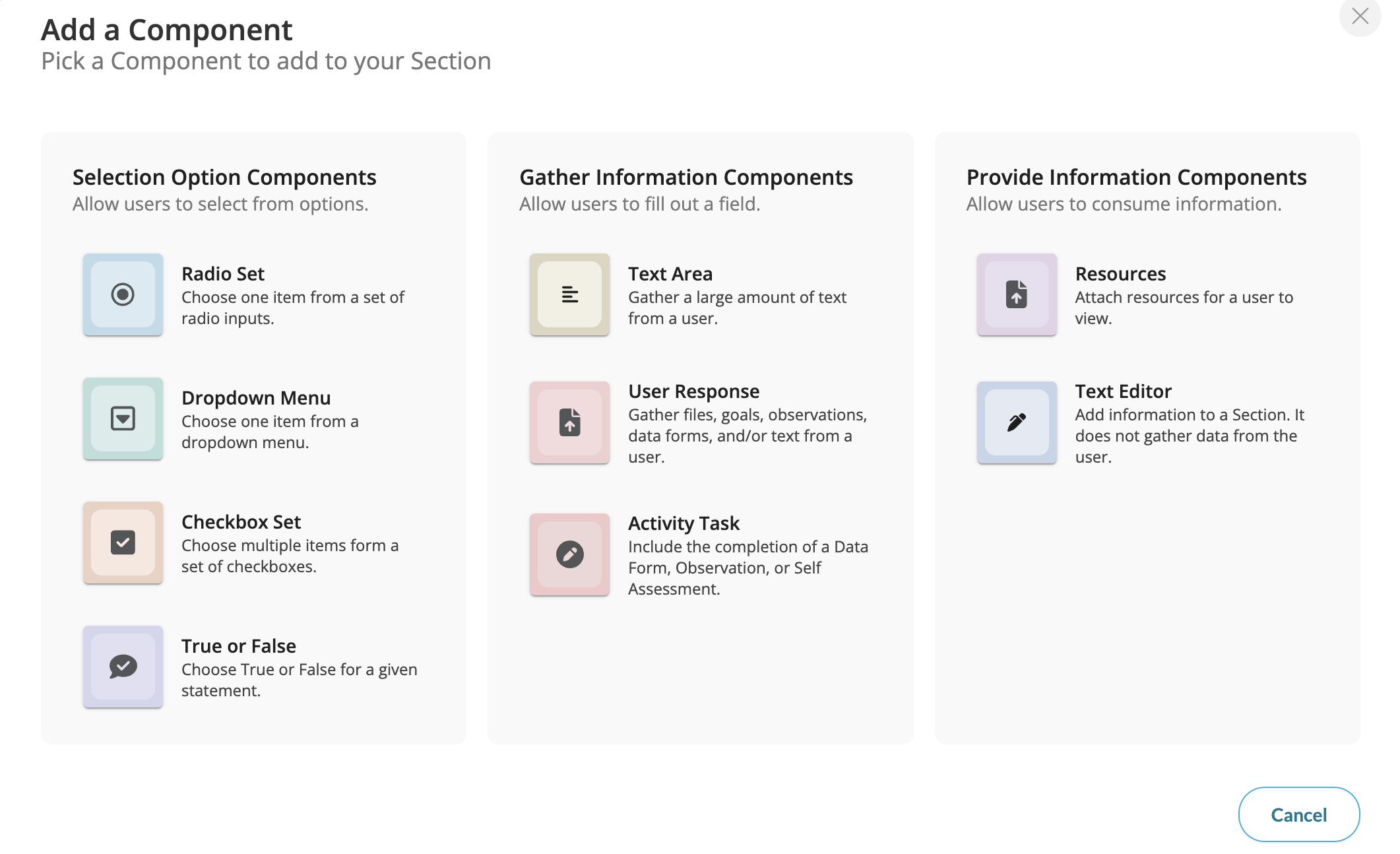
In the top, right-hand corner of each component you can add, you can further adjust it as needed with some general settings.

- To switch from one component type to another, click the 'switch icon.'

- To expand a component to see its edit options, click the 'expand icon.'

- To duplicate a component, click the 'duplicate icon.'

- To delete a component, click the 'trash bin icon.'

In order to adjust the display and look of a component, simply click in its general preview answer area, and the component will expand to show settings that allow you to manage the title, description and answer choices the users of your system will see!

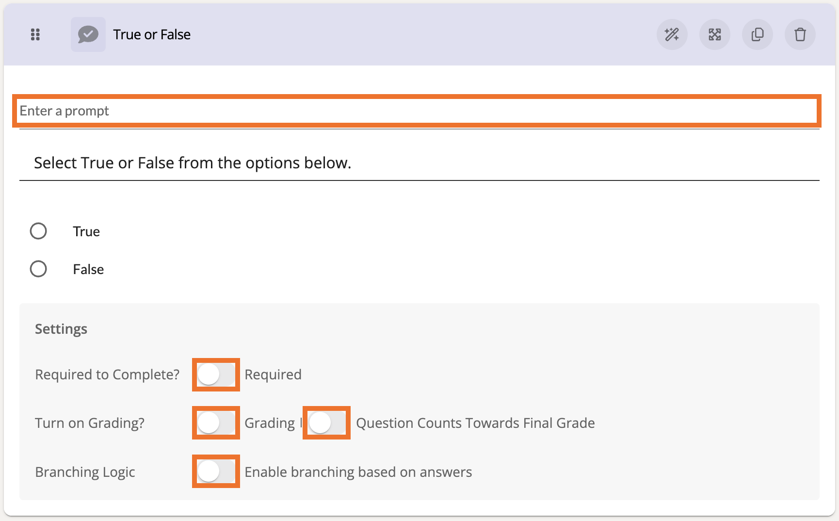
For most Selection Option components, you can designate it to be required, enable it for grading, count the question toward the final grade of the module, and enable Branching Logic .

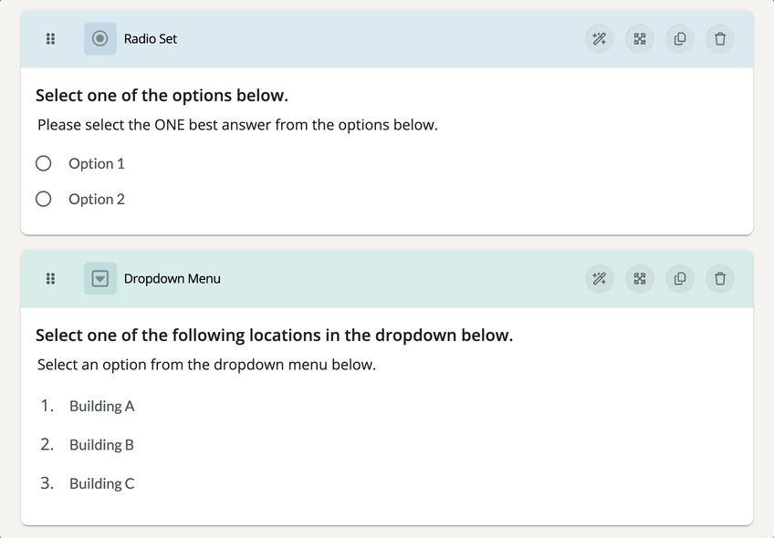
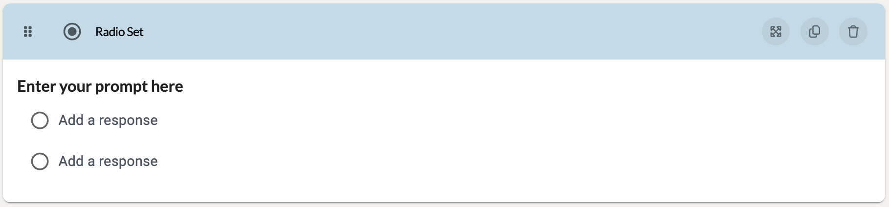
Radio Set
The Radio Set component allows users to choose one item from a set of radio button inputs. These can be useful when creating a multiple choice questionnaire.
Preview:
Settings:
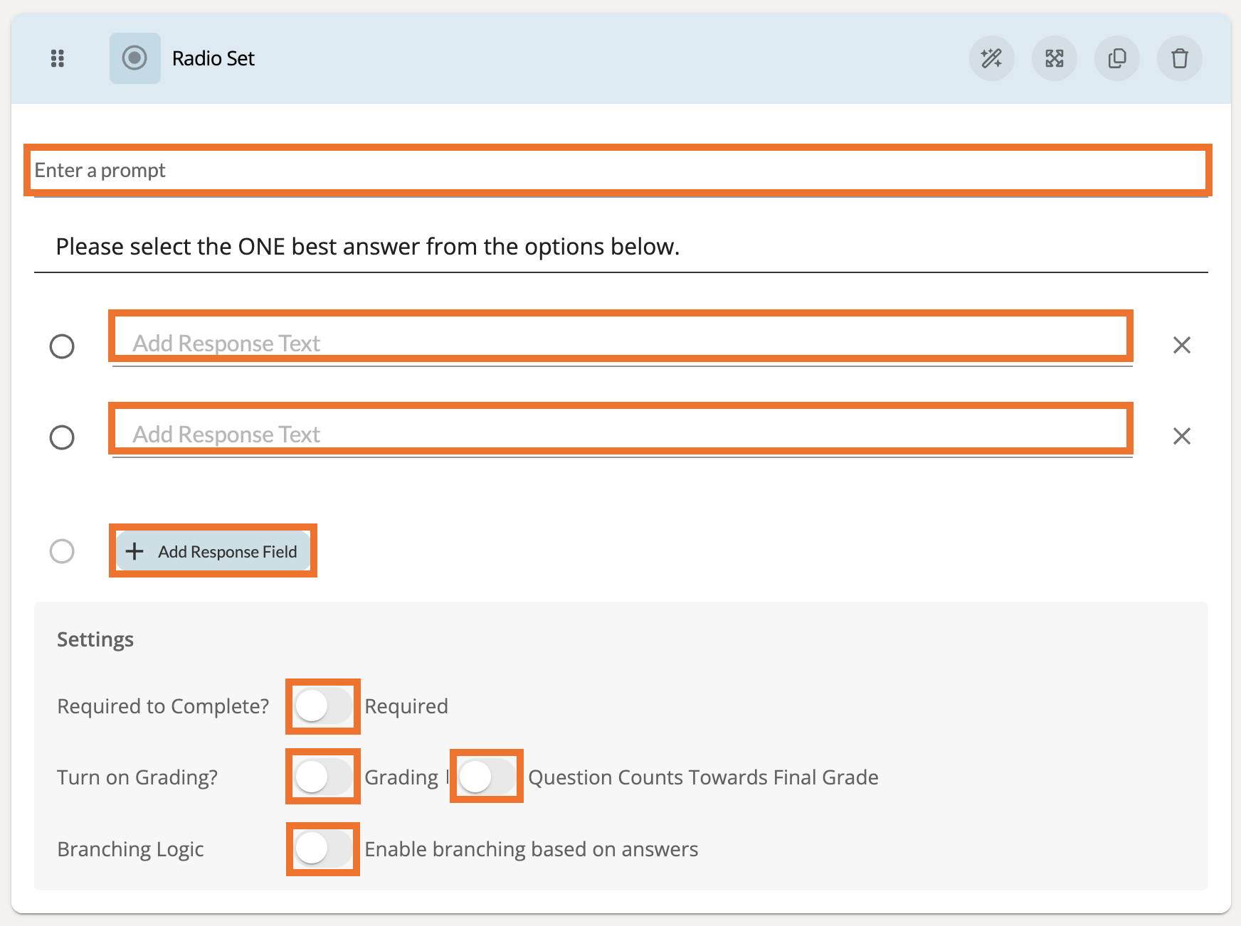
At the top of these settings, add a prompt to guide the participant. Make sure to add response text for each Response Field. If you would like for a response field to have a score/value, you can enter that beside the response text. You must have at least (2) Response Fields for this component.
To add another Response Field, click the '+ Add Response Field' button.

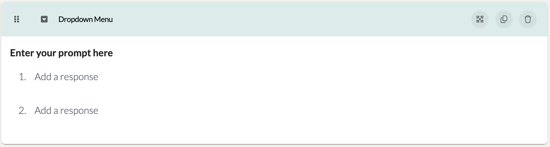
Dropdown Menu
The Dropdown Menu component allows participants to choose one item from a dropdown list. This can be useful if, say, participants need to select the location that their practice took place in.
Preview:
Settings:
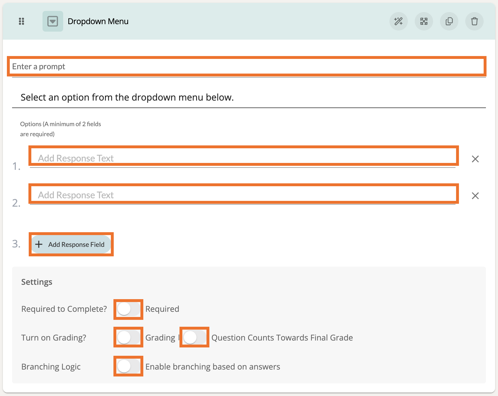
At the top of these settings, add a prompt to guide the participant. Make sure to add response text for each Response Field. If you would like for a response field to have a score/value, you can enter that beside the response text. You must have at least (2) Response Fields for this component.
To add another Response Field, click the '+ Add Response Field' button.

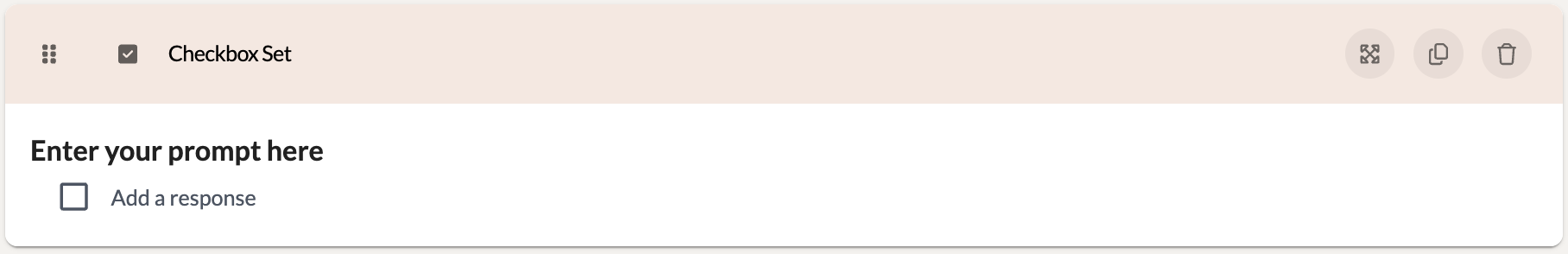
Checkbox Set
The Checkbox Set component allows participants to choose multiple items from a set of checkboxes. This can be useful for participants to check off all items that apply to their practice.
Preview:
Settings:
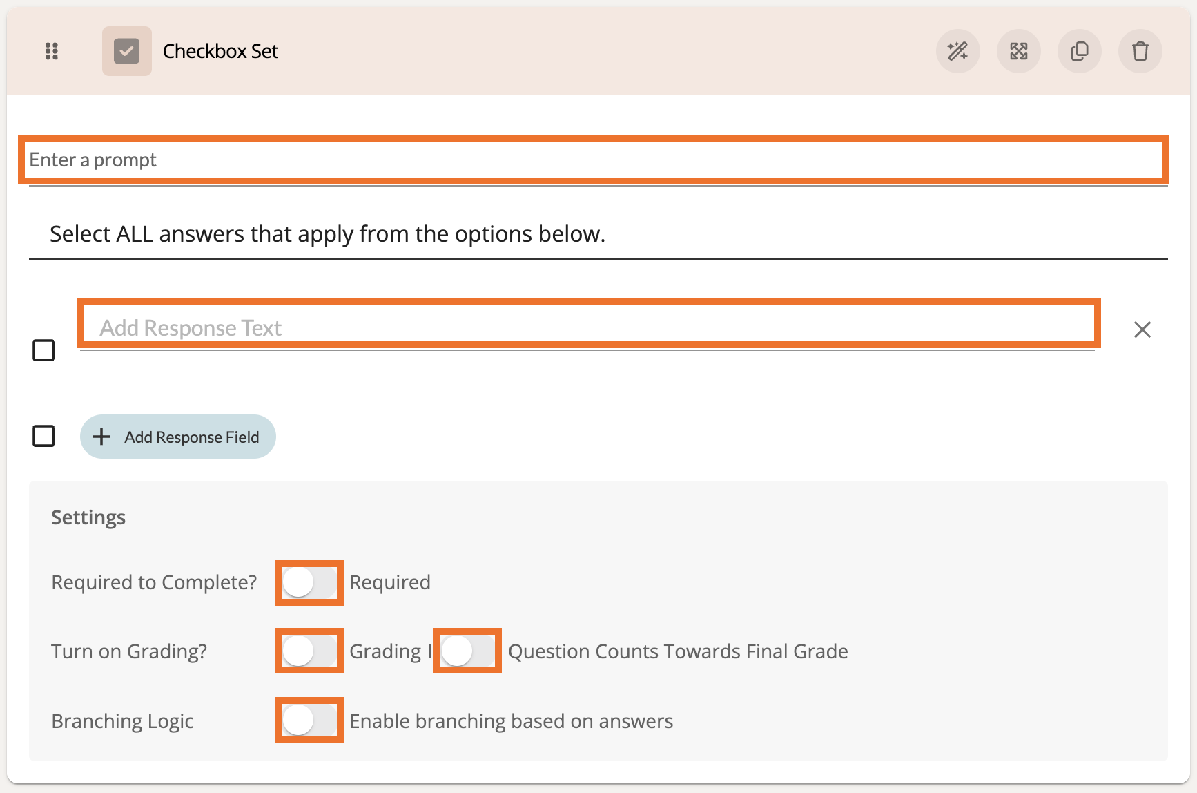
At the top of these settings, add a prompt to guide the participant. Make sure to add response text for the Response Field. If you would like for a response field to have a score/value, you can enter that beside the response text.
To add another Response Field, click the '+ Add Response Field' button.

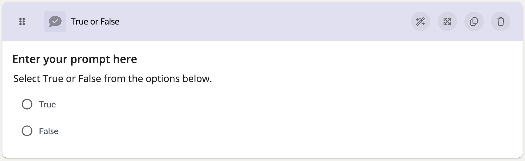
True or False
The True or False component allows participants to select if a statement is true or false. This can be useful to quiz participants based on their memory of previously taught material.
Preview:
Settings:
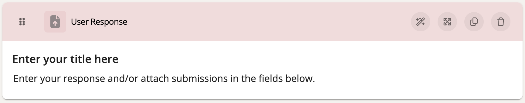
User Response
The User Response component offers a variety of options for a participant to respond with. Depending on the settings you enable, a participant can choose to either upload a video or file, insert a URL, and/or provide a typed response. This can be great when asking participants to provide a short answer to a question or when requesting for specific material be uploaded.
Preview:
Settings:
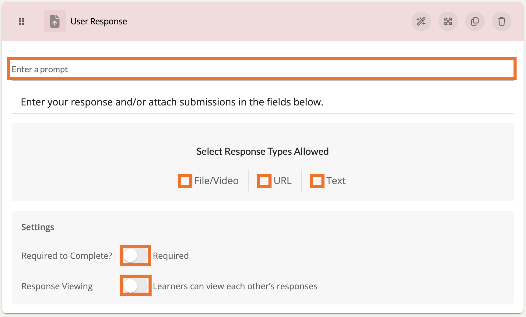
At the top, add a prompt to guide the participant. Then check off from the Select Response Types Allowed section to designate how a user can respond to this component.
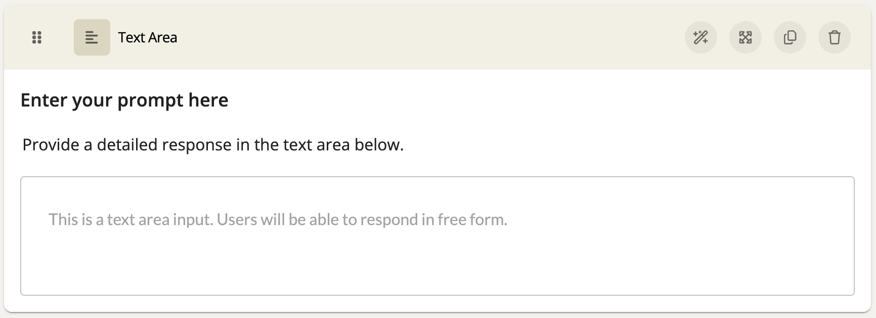
Text Area
A Text Area component offers a larger space to type a large amount of text for a response. This component can be useful when asking participants to respond in full sentences and paragraphs.
Preview:
Settings:
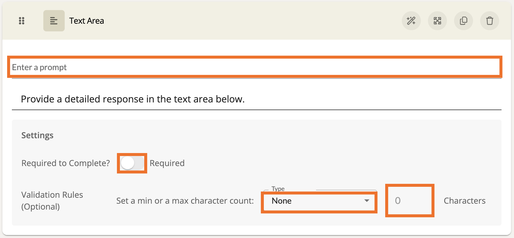
At the top, add a prompt to guide the participant. Below the prompt, you can also enforce a minimum character count permitted for the response as well as a character limit.
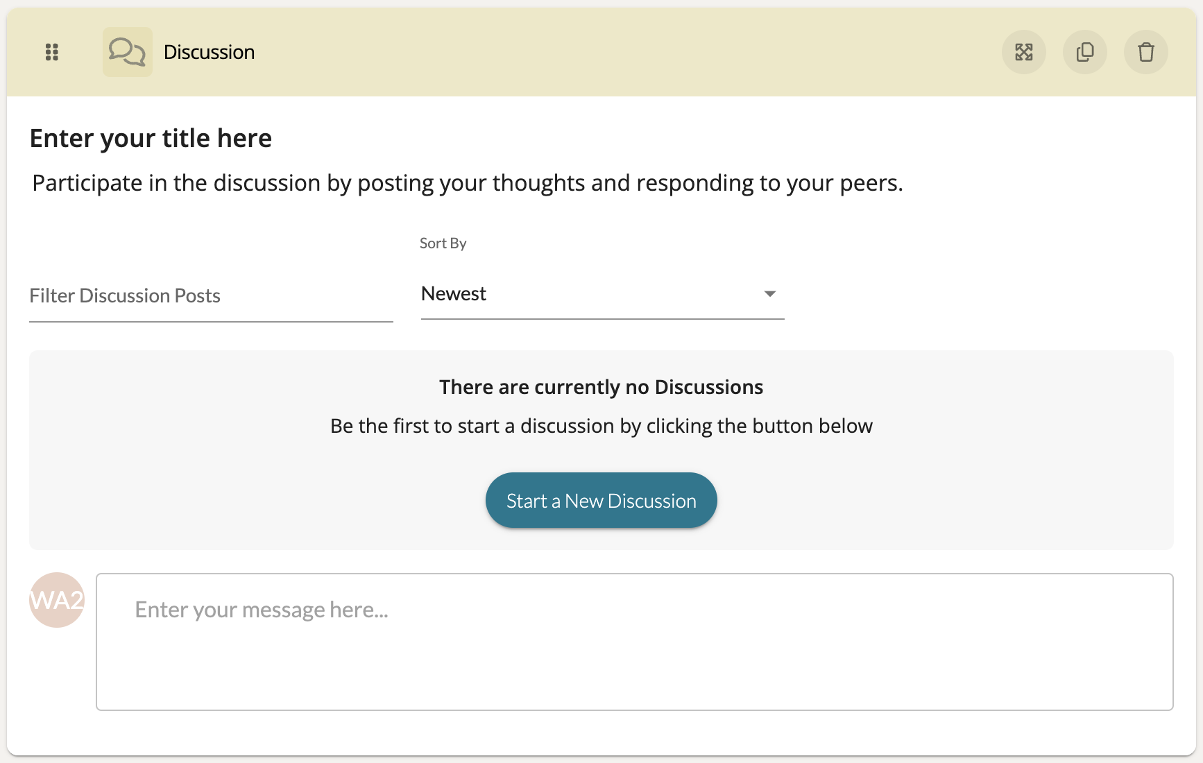
Discussion
A Discussion component allows participants to write and respond to one another. This is only available to modules with Discussion capability enabled. This can be useful for collaboration between members completing a shared training experience.
Preview:
Settings:
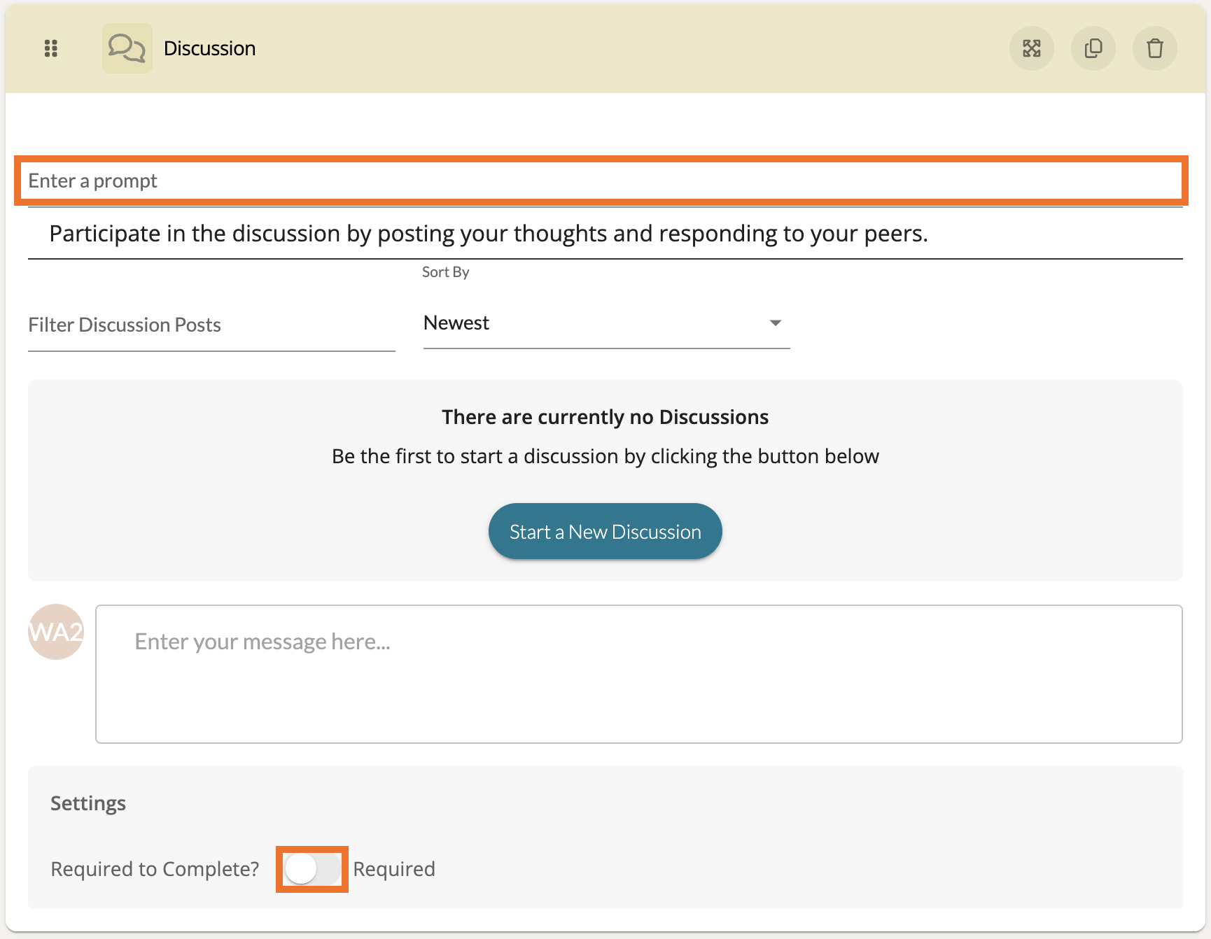
At the top, add a prompt to guide the participant.
Activity Task
As an Admin or an author/moderator of a Learning Path module, you can assign an Activity Task component to help direct learners in completing various observations, self assessments. Through the Activity Task, learners can evaluate assigned artifacts and complete forms directly through the Learning Path module!
To implement an Activity Task component, first open a module. Add a new Page if needed and add a Section to that page. Then choose 'Add Component.' In the list of components, choose the 'Activity Task' component.
Once the component has been added to the section, click on the Activity Task component to open its Edit view. Give your Activity a prompt title and a further description with instructions of what to complete.
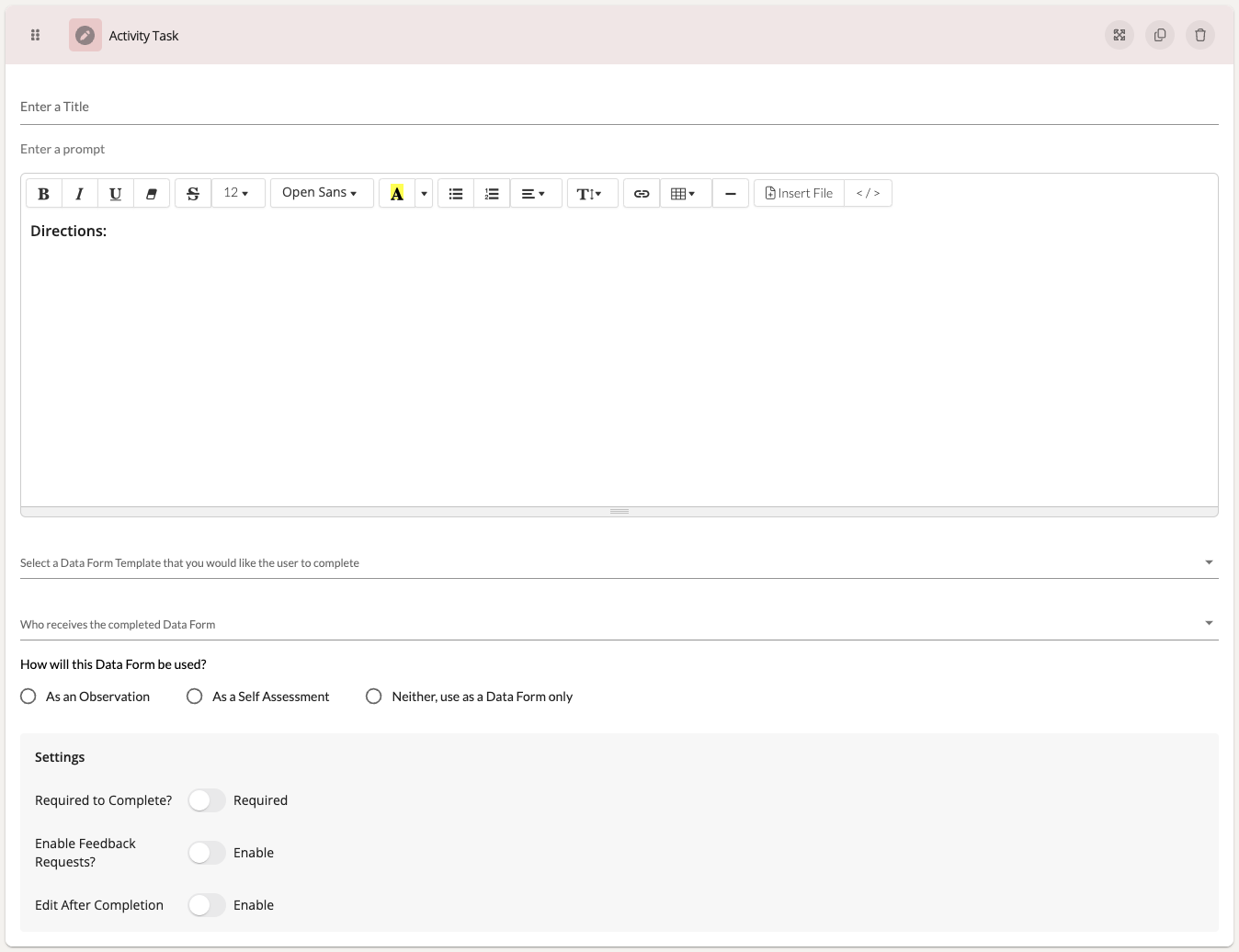
Next, choose the Data Form Template you would like for the user to complete. Then choose the user or group you would like to assign the completion of this form to.
Under 'How will this Data Form be used?' choose the the type of form you would like to have this template completed as:
- Observation
- Self Assessment
- Data Form
If you choose an Observation or Self Assessment, you will then be need to choose whether the form process is Informal/Formal and whether it is for an in-person session or for an uploaded artifact.

If the Observation or Self Assessment to complete is for an artifact, you will then be prompted to choose the artifact in question.
Afterwards, feel free to add an Resources (videos and/or files) that you think would be helpful for the completion of this task.

Lastly, you can mark this Activity Task component as 'Required' if necessary. You can also enable Feedback Requests in case you would like for the participant of the form to be able to request further feedback on what they observe. Lastly, you can enable 'Edit After Completion' for the participant of the form to make further adjustments after marking the form as complete.
To learn more about how a participant completes an Activity Task component, read this Help Center article here .
Resources
A Resources component allows participants to review various artifacts provided by the author. This can be helpful for referencing or learning specific material that they will be quizzed on later.
Preview:
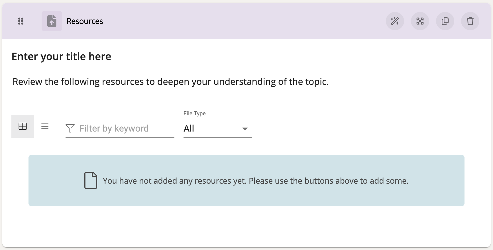
Settings:
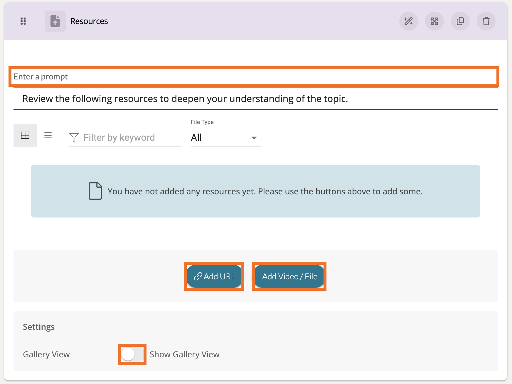
At the top, add a prompt to guide the participant.
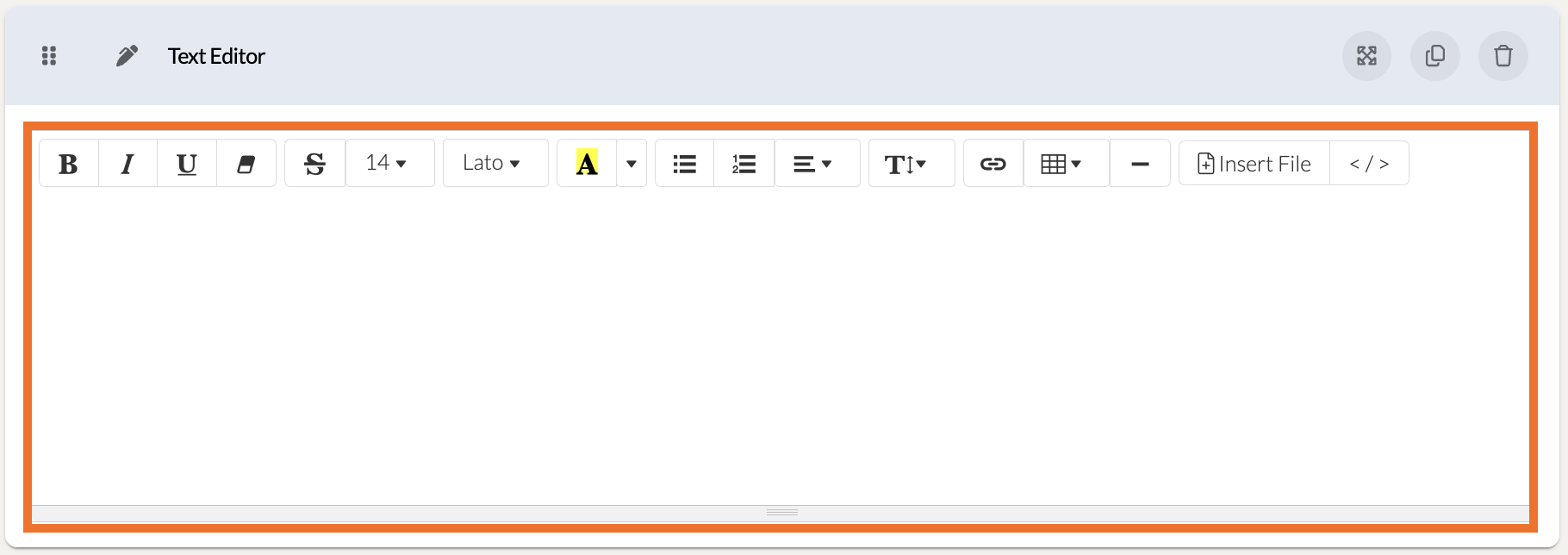
Text Editor
The Text Editor component is strictly for providing explanation and instruction from whomever is creating the data form template. This component does not gather any data, but it can be useful for providing further information in your forms.
Preview:
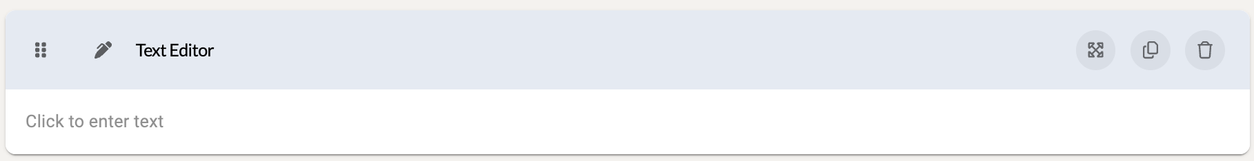
Settings:
Click on the space where your text would appear to reveal the text entry space. Here you can find multiple text formatting tools that you might find in your favorite word processor! You can even insert a file to display an image with your text!